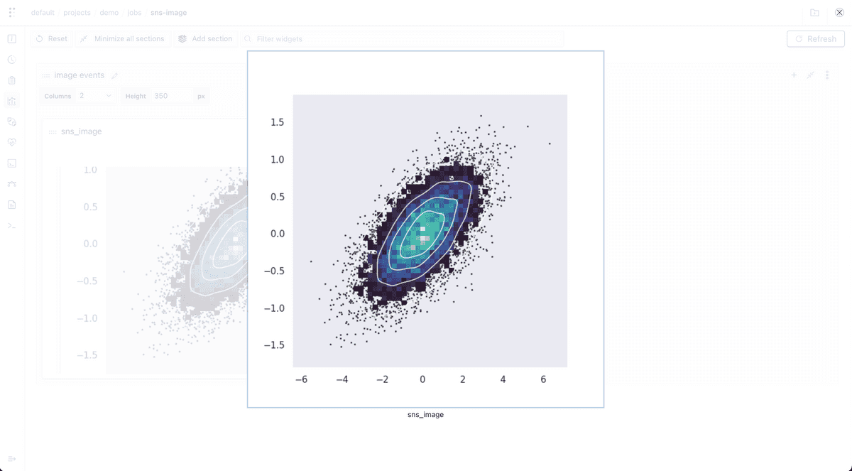
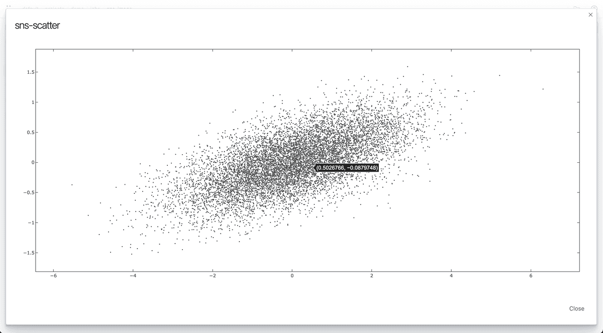
You can log and consume figures generated by Seaborn directly to Polyaxon.
Tracking
You can log any figure generated by Seaborn as images using the matplotlib figure interface images or as Plotly charts.
Dashboard
Any chart that is logged during the lifetime of your jobs or experiments can be rendered automatically in Polyaxon UI.
In notebooks
You can also consume any events or charts tracked in your experiments using the Python Library to programmatically visualize results in notebooks.
Downloading events
All charts and events are stored on your artifacts store, and follow any networking or security policy you set for your cluster. You can download any chart tracked to either render it manually or to archive it to a different location using the Python Library
Example logging Seaborn figure as an image
Python Script
import numpy as np
import seaborn as sns
import matplotlib.pyplot as plt
from polyaxon import tracking

tracking.init()

sns.set_theme(style="dark")
# Simulate data from a bivariate Gaussian
n = 10000
mean = [0, 0]
cov = [(2, .4), (.4, .2)]
rng = np.random.RandomState(0)
x, y = rng.multivariate_normal(mean, cov, n).T

# Draw a combo histogram and scatterplot with density contours
f, ax = plt.subplots(figsize=(6, 6))
sns.scatterplot(x=x, y=y, s=5, color=".15")
sns.histplot(x=x, y=y, bins=50, pthresh=.1, cmap="mako")
sns.kdeplot(x=x, y=y, levels=5, color="w", linewidths=1)

tracking.log_mpl_image(f, 'sns_image')
Example as an executable component
version: 1.1
kind: component
name: sns-image
run:
  kind: job
  init:
    - file:
        content: |
          import numpy as np
          import seaborn as sns
          import matplotlib.pyplot as plt
          from polyaxon import tracking

          tracking.init()

          sns.set_theme(style="dark")
          # Simulate data from a bivariate Gaussian
          n = 10000
          mean = [0, 0]
          cov = [(2, .4), (.4, .2)]
          rng = np.random.RandomState(0)
          x, y = rng.multivariate_normal(mean, cov, n).T

          # Draw a combo histogram and scatterplot with density contours
          f, ax = plt.subplots(figsize=(6, 6))
          sns.scatterplot(x=x, y=y, s=5, color=".15")
          sns.histplot(x=x, y=y, bins=50, pthresh=.1, cmap="mako")
          sns.kdeplot(x=x, y=y, levels=5, color="w", linewidths=1)

          tracking.log_mpl_image(f, 'sns_image')
        filename: script.py
  container:
    image: polyaxon/polyaxon-examples:artifacts
    name: polyaxon-main
    workingDir: '{{ globals.artifacts_path }}'
    command: [python3, -u, script.py]
Result
In the dashboards tab, create a new image widget

Example logging Seaborn figure as a Plotly chart
Python script
import numpy as np
import seaborn as sns
import matplotlib.pyplot as plt
from polyaxon import tracking

tracking.init()

sns.set_theme(style="dark")
# Simulate data from a bivariate Gaussian
n = 10000
mean = [0, 0]
cov = [(2, .4), (.4, .2)]
rng = np.random.RandomState(0)
x, y = rng.multivariate_normal(mean, cov, n).T

# Draw a combo histogram and scatterplot with density contours
f, ax = plt.subplots(figsize=(6, 6))
sns.scatterplot(x=x, y=y, s=5, color=".15")
sns.histplot(x=x, y=y, bins=50, pthresh=.1, cmap="mako")
sns.kdeplot(x=x, y=y, levels=5, color="w", linewidths=1)

tracking.log_mpl_plotly_chart(name='sns-scatter', figure=plt)
Example as an executable component
version: 1.1
kind: component
name: sns-image
run:
  kind: job
  init:
    - file:
        content: |
          import numpy as np
          import seaborn as sns
          import matplotlib.pyplot as plt
          from polyaxon import tracking

          tracking.init()

          sns.set_theme(style="dark")
          # Simulate data from a bivariate Gaussian
          n = 10000
          mean = [0, 0]
          cov = [(2, .4), (.4, .2)]
          rng = np.random.RandomState(0)
          x, y = rng.multivariate_normal(mean, cov, n).T

          # Draw a combo histogram and scatterplot with density contours
          f, ax = plt.subplots(figsize=(6, 6))
          sns.scatterplot(x=x, y=y, s=5, color=".15")
          sns.histplot(x=x, y=y, bins=50, pthresh=.1, cmap="mako")
          sns.kdeplot(x=x, y=y, levels=5, color="w", linewidths=1)

          tracking.log_mpl_plotly_chart(name='sns-scatter', figure=plt)
        filename: script.py
  container:
    image: polyaxon/polyaxon-examples:artifacts
    name: polyaxon-main
    workingDir: '{{ globals.artifacts_path }}'
    command: [python3, -u, script.py]
Result
In the dashboards tab, create a new custom chart widget


