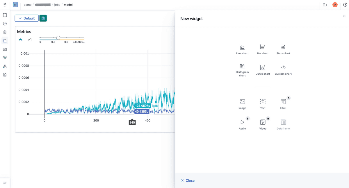
Polyaxon comes with a powerful and customizable visualization system for driving insights in the dashboard or programmatically.

Native visualization system
Polyaxon dashboard provides several visualizations and charts based on events logged by the tracking API.
For single runs:
- Line charts
- Bar charts
- Stats charts
- Histogram charts
- Curve charts: PR curves, AUC/ROC curves, custom curves (<x, y> arrays)
For multi-run you can compare metrics and curves from several runs, as well as charts for hyperparameter values and metrics:
- Line charts
- Bar charts
- Stats charts
- Curve charts: PR curves, AUC/ROC curves, custom curves (<x, y> arrays)
- Scatter charts
- Parallel coordinates
- Contour plots
Media rendering
Polyaxon can render several media types, you can log several versions of the same media with a step index:
- images
- text
- html
- audio
- video
- dataframe
Custom Charts
Oftentimes users have advance use cases that are not supported by the platform, or they need to integrate visualizations generated by external systems.
Polyaxon can consume any chart specification generated by these libraries:
- Matplotlib
- Plotly
- Bokeh
- Altair/Vega
Programmatic Experience
Polyaxon has a programmatic experience for generating visualizations for single runs or multi-run using:
- Plotly express
- HiPlot
Tensorboard
Tensorboard is a tool that is used by data scientists to visualize and debug deep learning models. Polyaxon provides several ways for using tensorboard:
- Tensorboard for a single run
- Tensorboard for a multi-run
- Tensorboard based on metric(s) performance or a search
Example
You can run the artifacts example which calls several tracking methods and logs several metadata and artifact types.