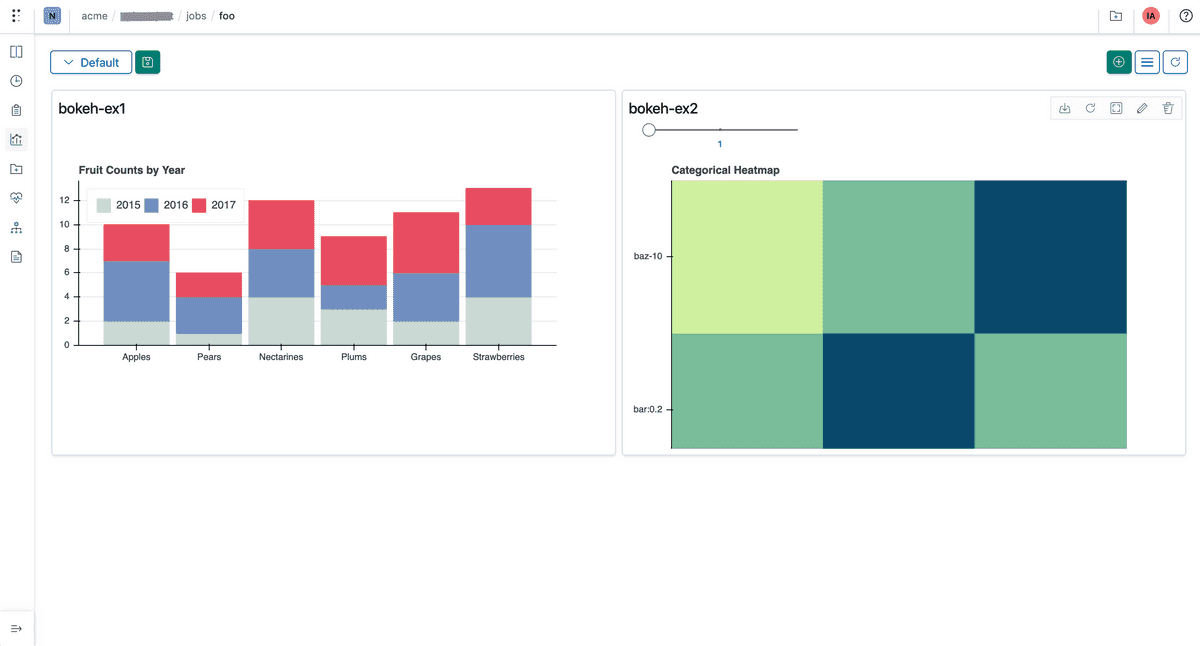
You can log and consume charts generated by Bokeh directly to Polyaxon.
Tracking
You can log any chart generated by Bokeh using Polyaxon’s tracking module.
Dashboard
Any chart that is logged during the lifetime of your jobs or experiments can be rendered automatically in Polyaxon UI.
In notebooks
You can also consume any events or charts tracked in your experiments using the Python Library to programmatically visualize results in notebooks.
Downloading events
All charts and events are stored on your artifacts store, and follow any networking or security policy you set for your cluster. You can download any chart tracked to either render it manually or to archive it to a different location using the Python Library
Example
Python Script
from bokeh.plotting import figure

from polyaxon import tracking

tracking.init()

factors = ["a", "b", "c", "d", "e", "f", "g", "h"]
x = [50, 40, 65, 10, 25, 37, 80, 60]

dot = figure(title="Categorical Dot Plot", tools="", toolbar_location=None,
             y_range=factors, x_range=[0, 100])

dot.segment(0, factors, x, factors, line_width=2, line_color="green", )
dot.circle(x, factors, size=15, fill_color="orange", line_color="green", line_width=3, )

factors = ["foo 123", "bar:0.2", "baz-10"]
x = ["foo 123", "foo 123", "foo 123", "bar:0.2", "bar:0.2", "bar:0.2", "baz-10", "baz-10",
     "baz-10"]
y = ["foo 123", "bar:0.2", "baz-10", "foo 123", "bar:0.2", "baz-10", "foo 123", "bar:0.2",
     "baz-10"]
colors = [
    "#0B486B", "#79BD9A", "#CFF09E",
    "#79BD9A", "#0B486B", "#79BD9A",
    "#CFF09E", "#79BD9A", "#0B486B"
]

hm = figure(title="Categorical Heatmap", tools="hover", toolbar_location=None,
            x_range=factors, y_range=factors)

hm.rect(x, y, color=colors, width=1, height=1)

tracking.log_bokeh_chart(name='confusion-bokeh', figure=hm)
Example as an executable component
version: 1.1
kind: component
name: bokeh-chart
run:
  kind: job
  init:
    - file:
        filename: script.py
        content: |
              from bokeh.plotting import figure

              from polyaxon import tracking

              tracking.init()

              factors = ["a", "b", "c", "d", "e", "f", "g", "h"]
              x = [50, 40, 65, 10, 25, 37, 80, 60]

              dot = figure(title="Categorical Dot Plot", tools="", toolbar_location=None,
                           y_range=factors, x_range=[0, 100])

              dot.segment(0, factors, x, factors, line_width=2, line_color="green", )
              dot.circle(x, factors, size=15, fill_color="orange", line_color="green", line_width=3, )

              factors = ["foo 123", "bar:0.2", "baz-10"]
              x = ["foo 123", "foo 123", "foo 123", "bar:0.2", "bar:0.2", "bar:0.2", "baz-10", "baz-10",
                   "baz-10"]
              y = ["foo 123", "bar:0.2", "baz-10", "foo 123", "bar:0.2", "baz-10", "foo 123", "bar:0.2",
                   "baz-10"]
              colors = [
                  "#0B486B", "#79BD9A", "#CFF09E",
                  "#79BD9A", "#0B486B", "#79BD9A",
                  "#CFF09E", "#79BD9A", "#0B486B"
              ]

              hm = figure(title="Categorical Heatmap", tools="hover", toolbar_location=None,
                          x_range=factors, y_range=factors)

              hm.rect(x, y, color=colors, width=1, height=1)

              tracking.log_bokeh_chart(name='confusion-bokeh', figure=hm)
  container:
    image: 'polyaxon/polyaxon-examples:ml'
    workingDir: '{{ globals.artifacts_path }}'
    command: [python3, -u, script.py]
Result
In the dashboards tab, create a new custom chart widget


